Roman
I was the Creative Director of Roman – the men's digital health clinic unicorn. Roman was by far the biggest revenue driver, most mature and most visible line of business for Ro.
My mandate was to tell compelling, authentic, and empathetic stories to elevate the brand at the very top of the funnel all the way down to nitty-gritty conversions. What does that actually mean? Translation: We made a LOT of amazing stuff.
I led a wonderful creative team and collaborated with lovely cross-functional partners through many national integrated campaigns, large commercial productions, new product launches, an MLB partnership, in-store activations, a brand identity revamp, and a serious volume of evergreen performance collateral.
Not only was I super proud of the amazing creative that we put out into the world. But it also performed. Check it out below!
Agency
Ro in-house
Year
2021-2022
My Role
Creative Direction
Art Direction
Campaign Development
Creative Concept Development
Scriptwriting
Brand Identity
Roman
Ready
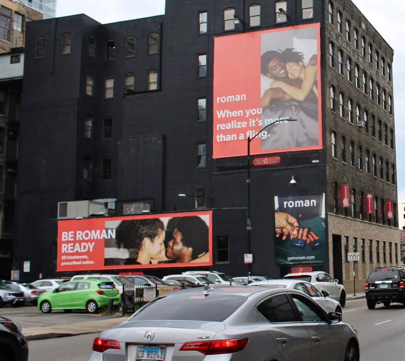
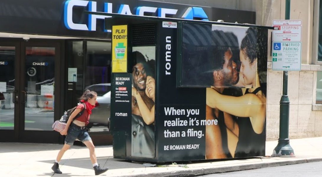
We created this bold and inclusive campaign to center on what ED is really about for our target: sex and relationships. We unapologetically addressed these themes two head on to authentically communicate how Roman can help bring your best, confident self to your partner. We cast of diverse couples to further reinforce that ED transcends age, ethnicity and orientation. We created a couple of TV spots that ran nationally, produced many OOH ads in major metros, and crafted a host of digital placements.



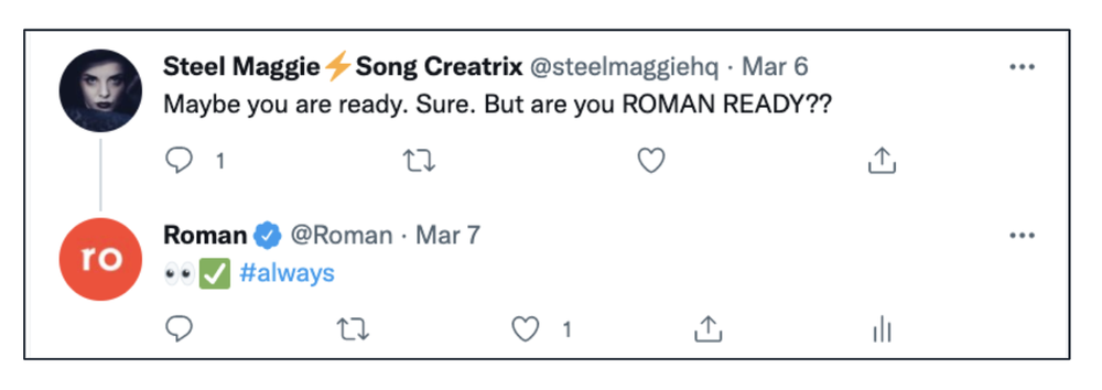
Online Buzz
CREDITSCreative Direction: Jonathan Campo, Katie O’Keefe
Director: Eric Ryan Anderson
Production Company: Bindery
Code Words
After the success of the Roman Ready campaign, we maintained the “Roman Ready” umbrella but tried out a little something different tonally – comedy. ED is a serious condition. So how do we craft a message that uses humor to increase empathy and convey couples’ unique intimacy? By highlighting couples’ own intimate language – their “code words” – that they used for initiating some afternoon delight. Whatever you call it, you can be ready with Roman.
Adweek thought it was cool. It was also a personal triumph to create a spot with only two words of dialogue. Behold:


CREDITSCreative Direction: Jonathan Campo
Concept + Copywriting: Justine Berger + Adi Schlank
Director: Eric Ryan Anderson
Production Company: Bindery
Roman Focus
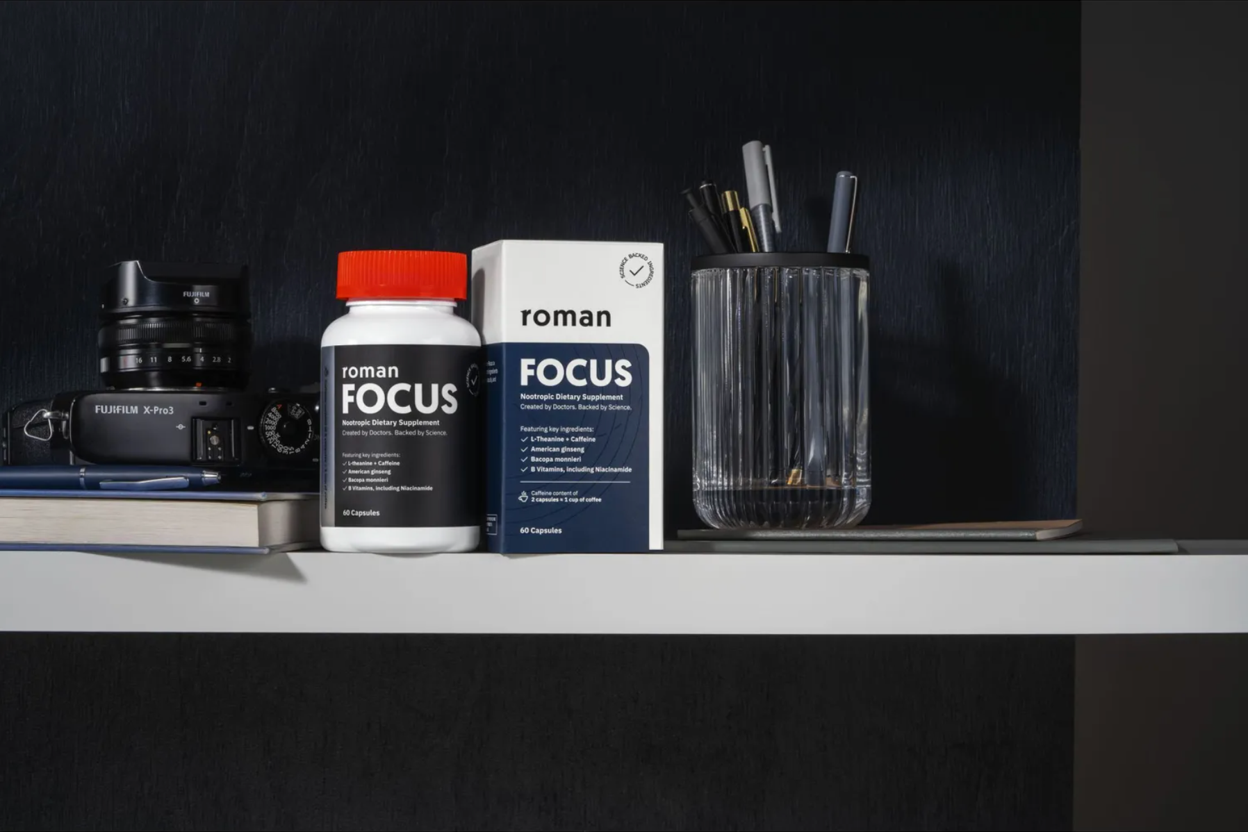
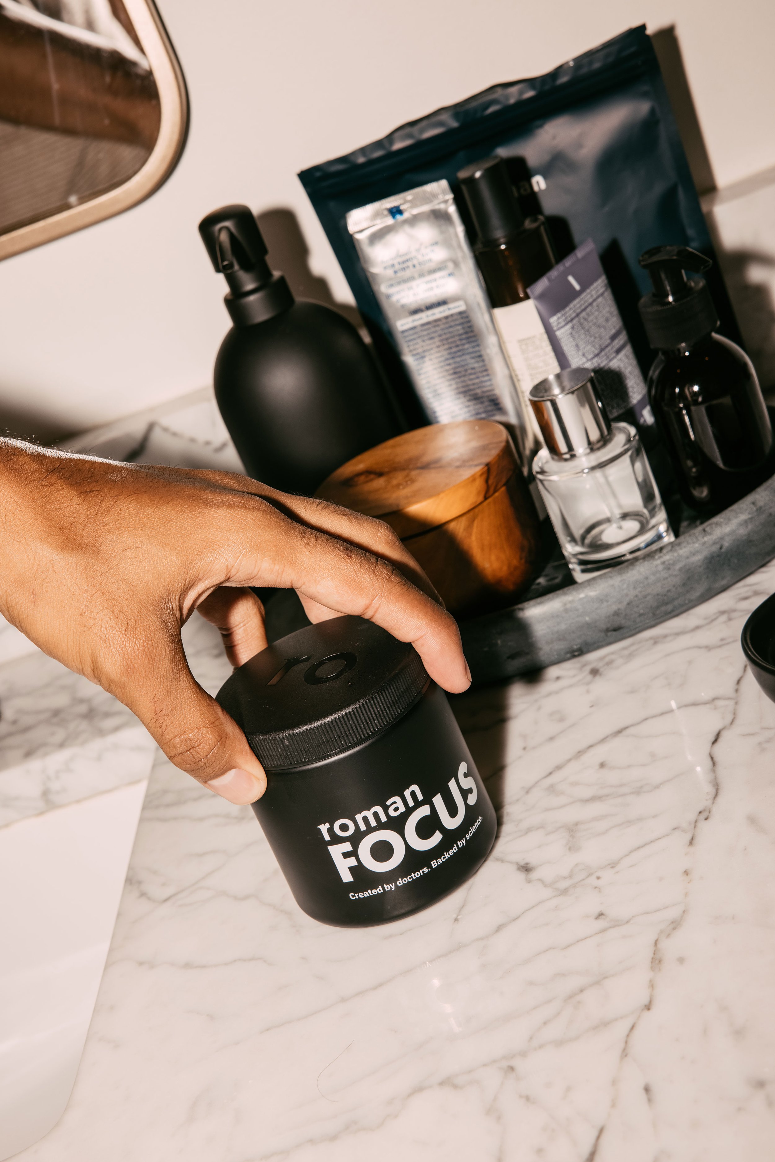
In addition to campaigns, we regularly launched new products. Sometimes these were new supplements that we wanted to flex into their own distinct visual look and feel to stand out online and on shelf in their respective category. Roman Focus was a particular interesting, in that it’s a nootropic dietary supplement with ingredients that support calm energy, mental acuity, and concentration – which was unchartered territory for the brand. So we opted for a bold yet minimal aesthetic that would communicate this cutting edge nootropic dietary supplement with ingredients that support calm energy, mental acuity, and concentration.
CREDITSCreative Direction: Jonathan Campo
Art Direction + Design: Talon Hernandez
Copywriting: Justine Berger
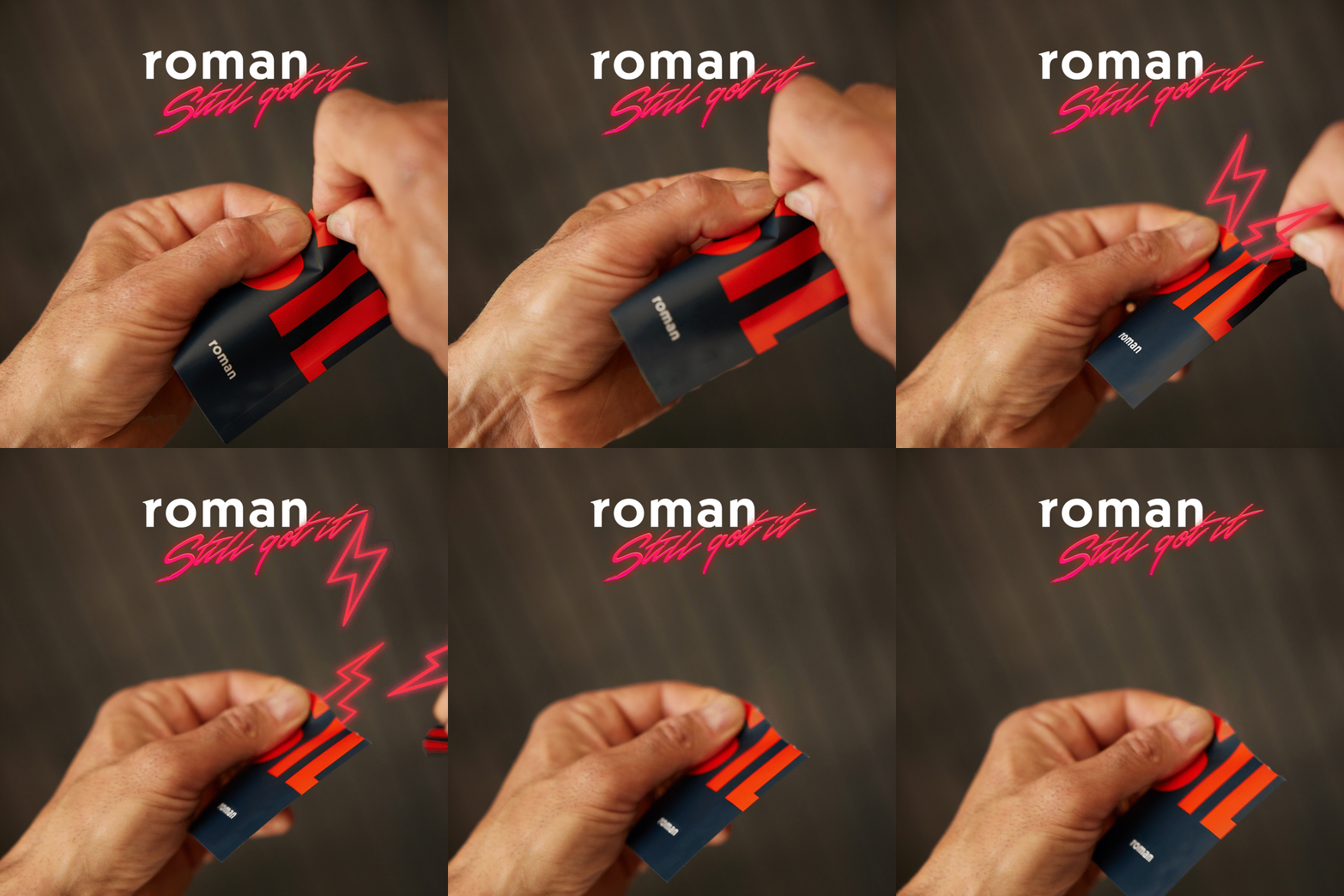
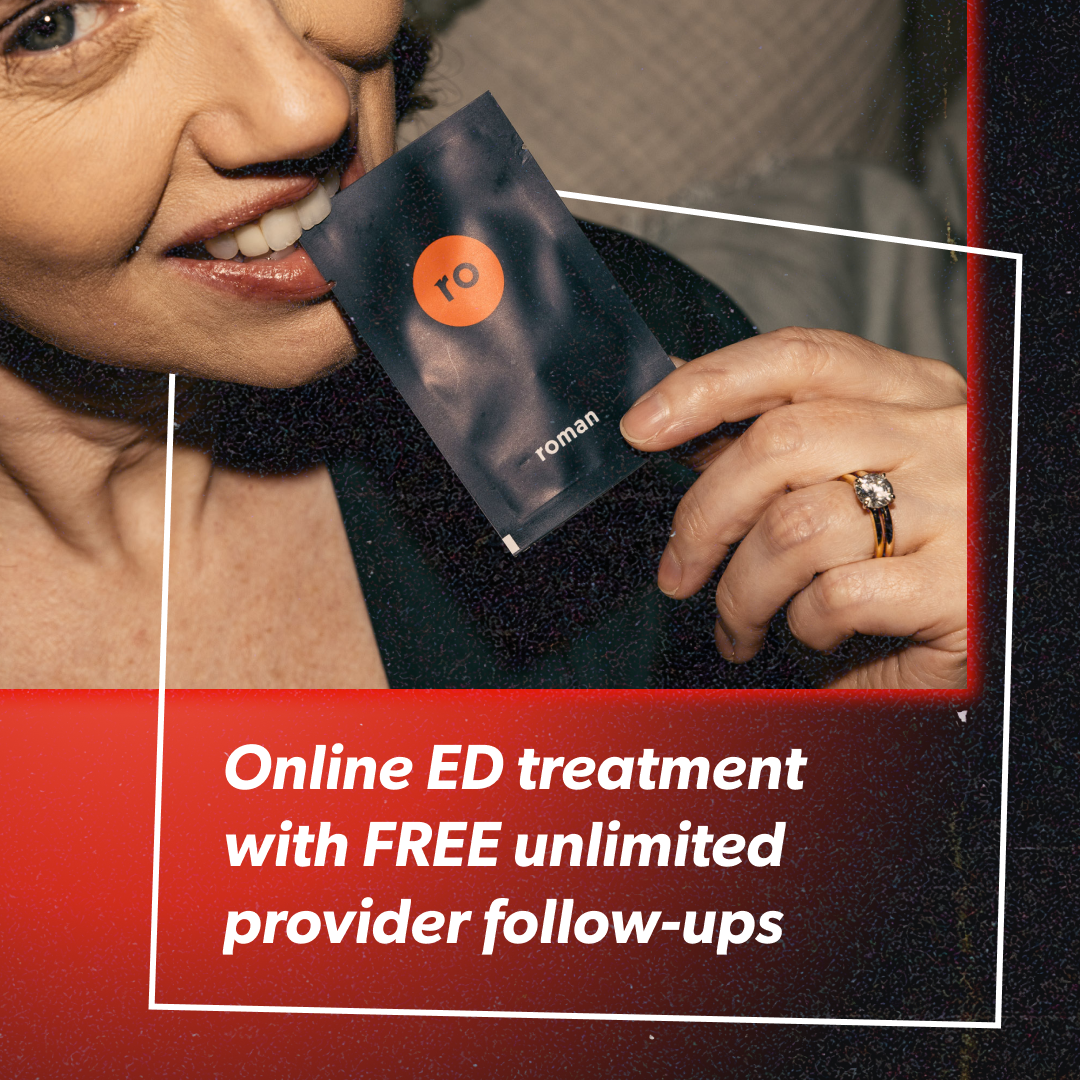
Still Got It
Remember when you felt most engaged and intimate in your relationship? The glory days? Well, there’s no reason you can’t rekindle the flame. In fact, with a little help from Roman, you’ve still got it. We made a throwback campaign and had a little too much fun with late 80s/early 90s art direction in order to resonate with our demographic’s memories of youthful swagger.
Panther Wagon
Going a step beyond the easter egg, we actually created the Panther Wagon band, their backstory (you can read about the 90s rock legends here) and composed an epic power ballad for your listening pleasure.


Some fun with TikTok
CREDITSCreative Direction: Jonathan Campo
Concept + Copy: Topher Cusumano, Michael Stangle, Rocky Racovic
Art Direction: Luka Gavasheli, Alison Chaikittirattana
Director: Eric Ryan Anderson
Production Company: Bindery
Brand revamp
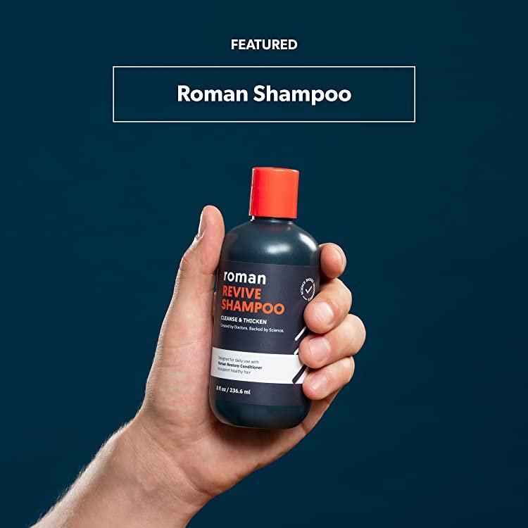
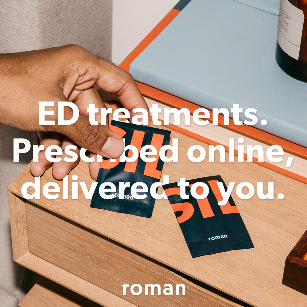
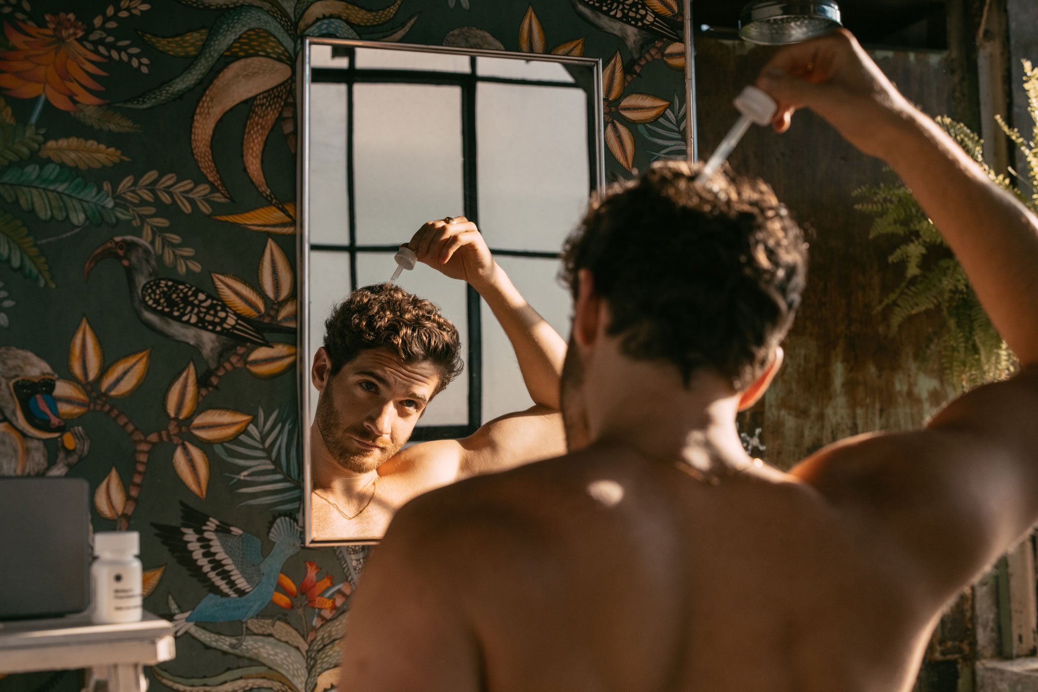
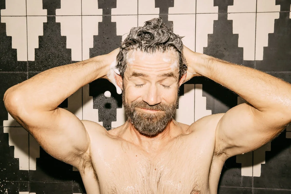
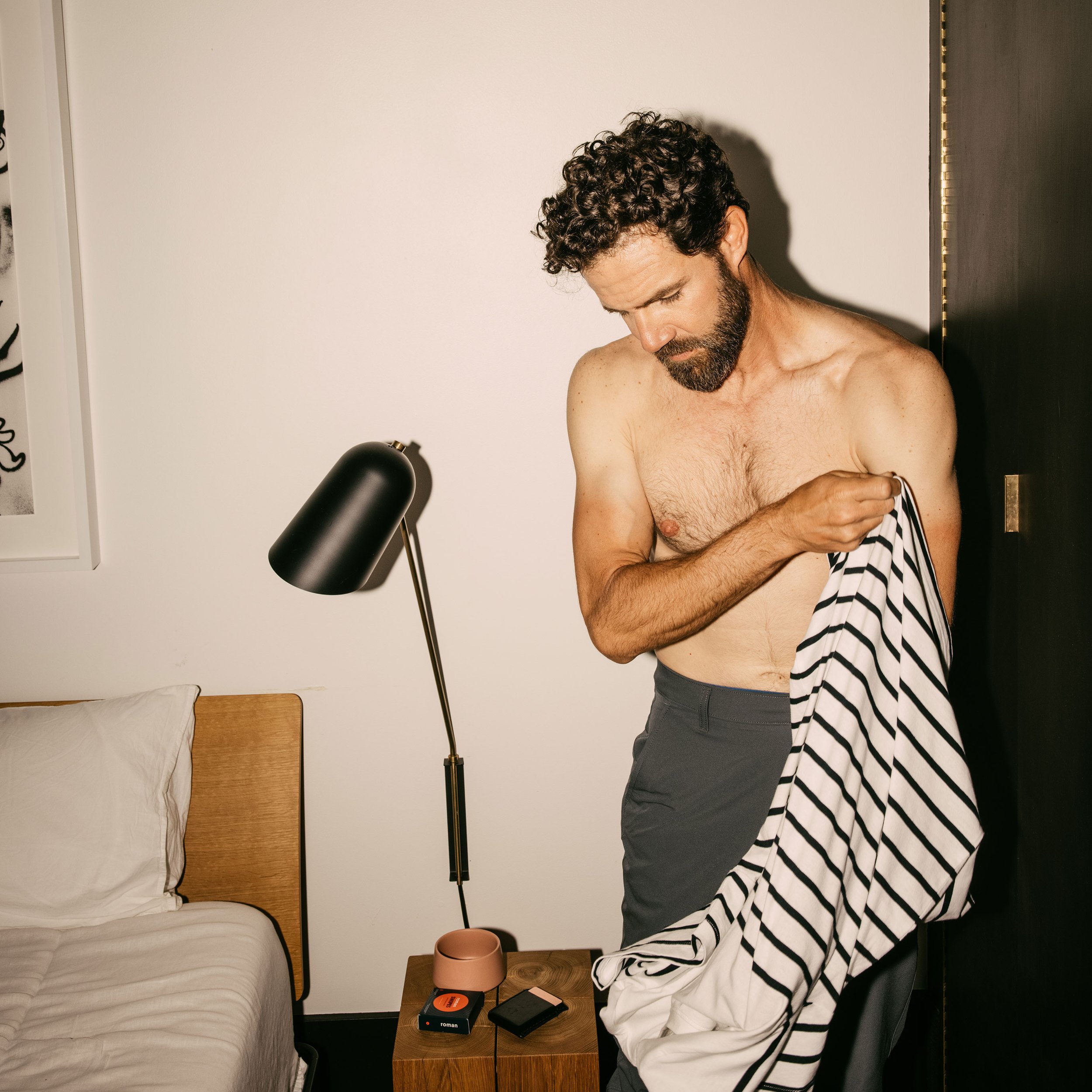
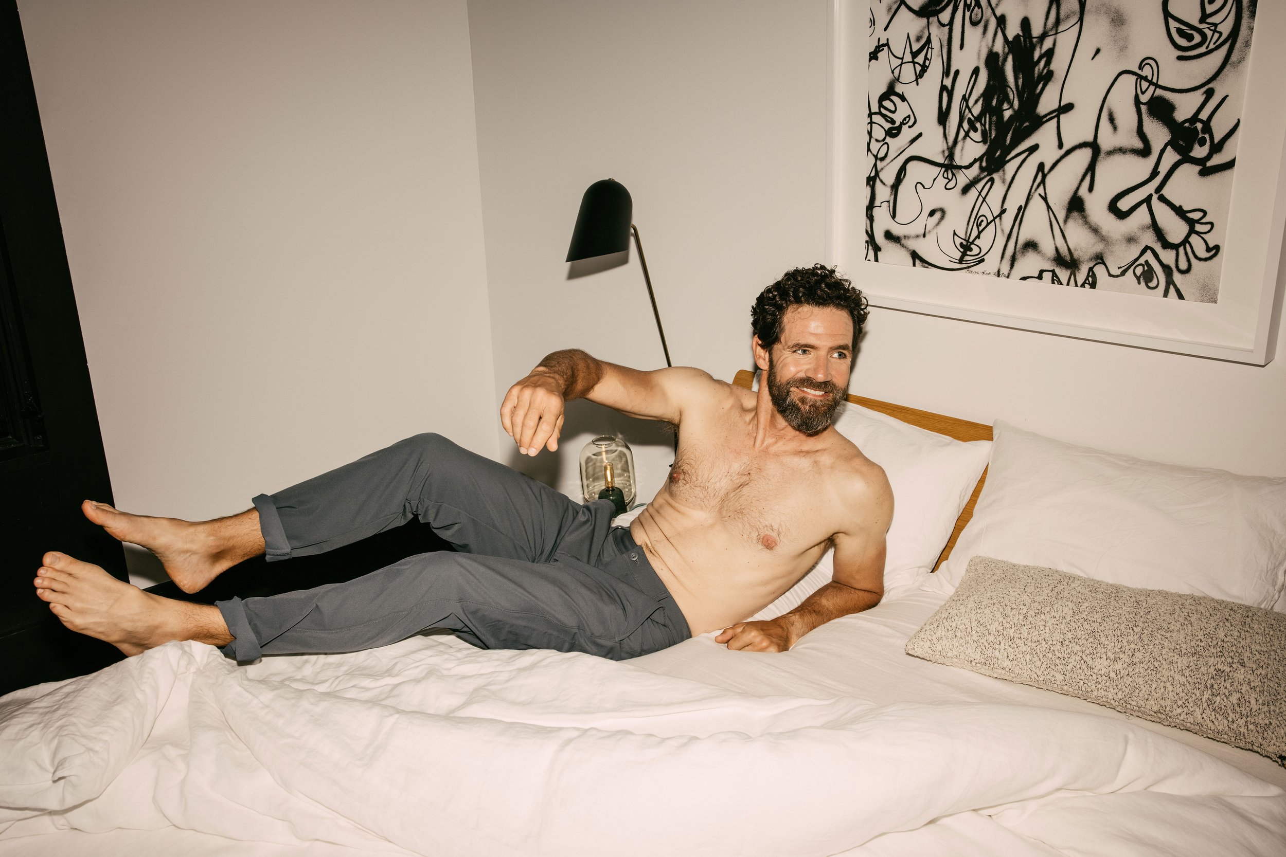
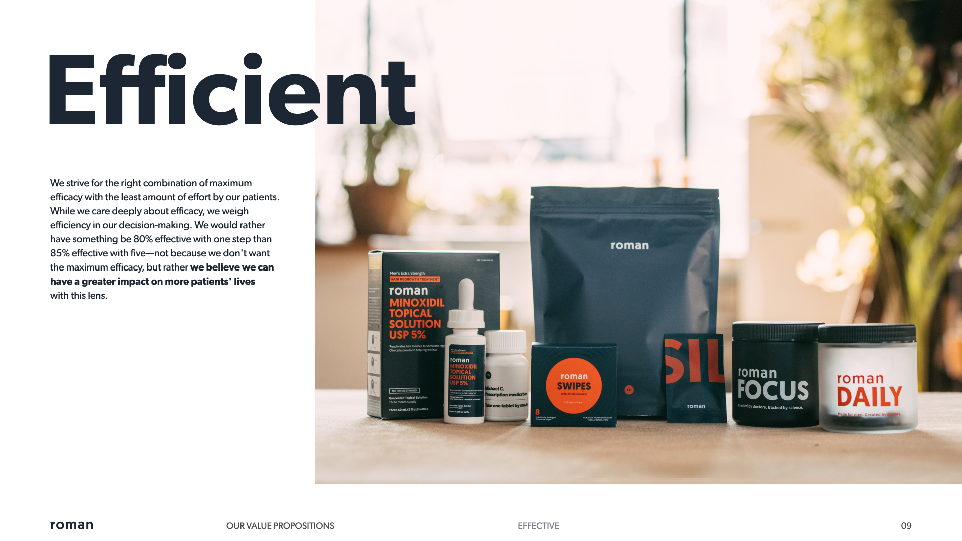
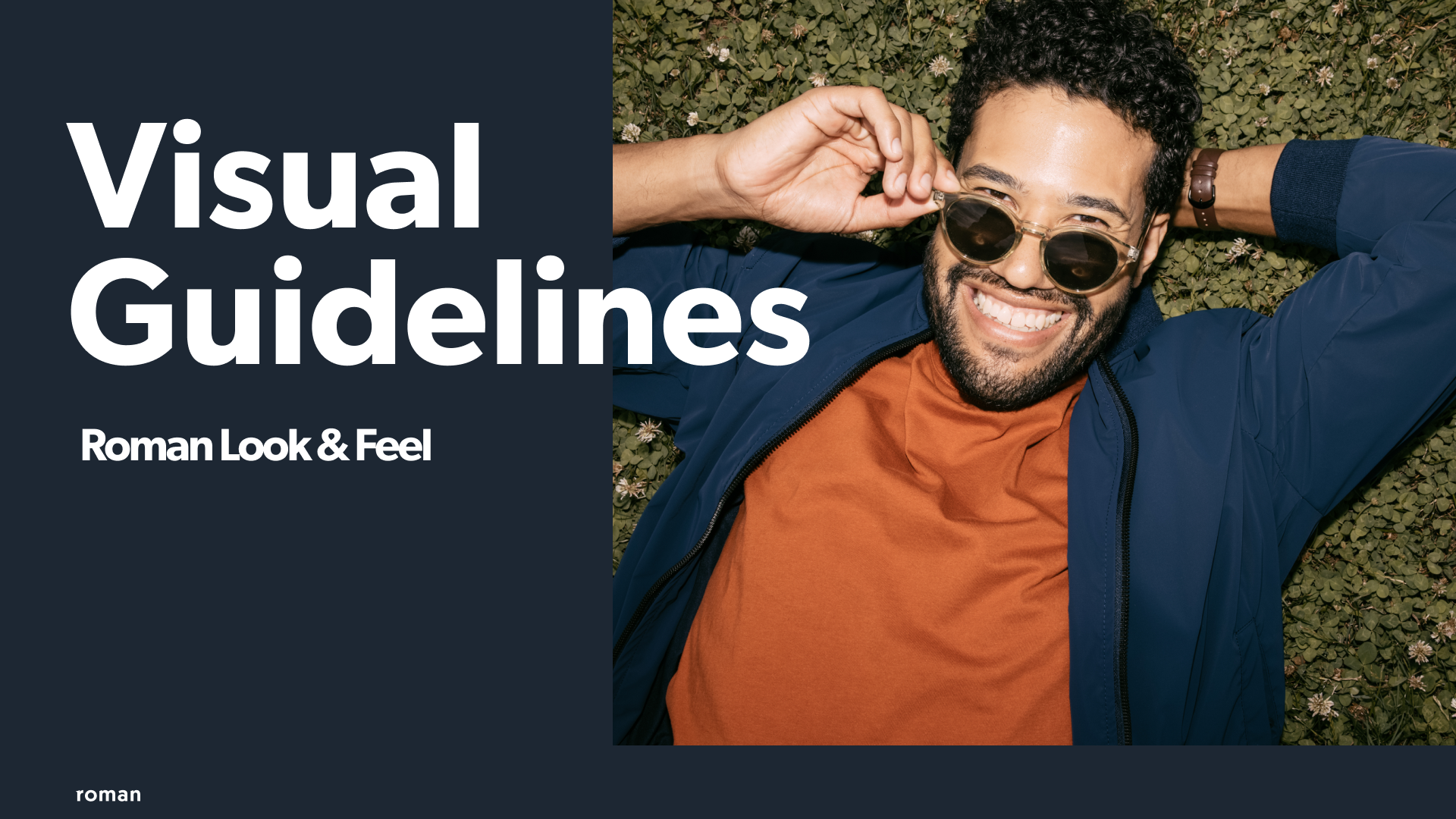
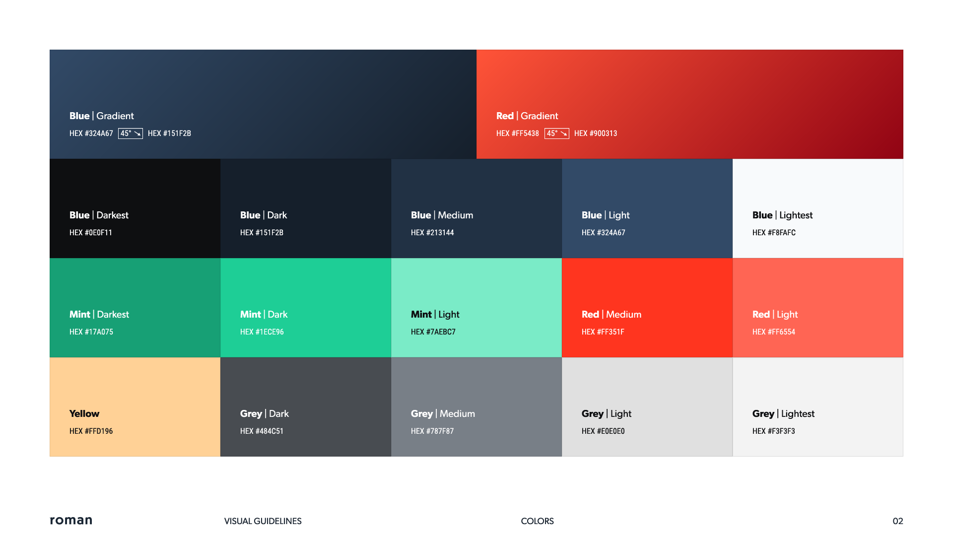
We took the tonality of the Roman Ready campaign as a north star to create a new photographic look and feel for the Roman brand. We traded in clinical abstraction and studio shots for lived-in authenticity. We wanted to show how Roman products fit into the everyday fabric of life and unlocked your day-to-day when you health is taken care of.













Retail supplements
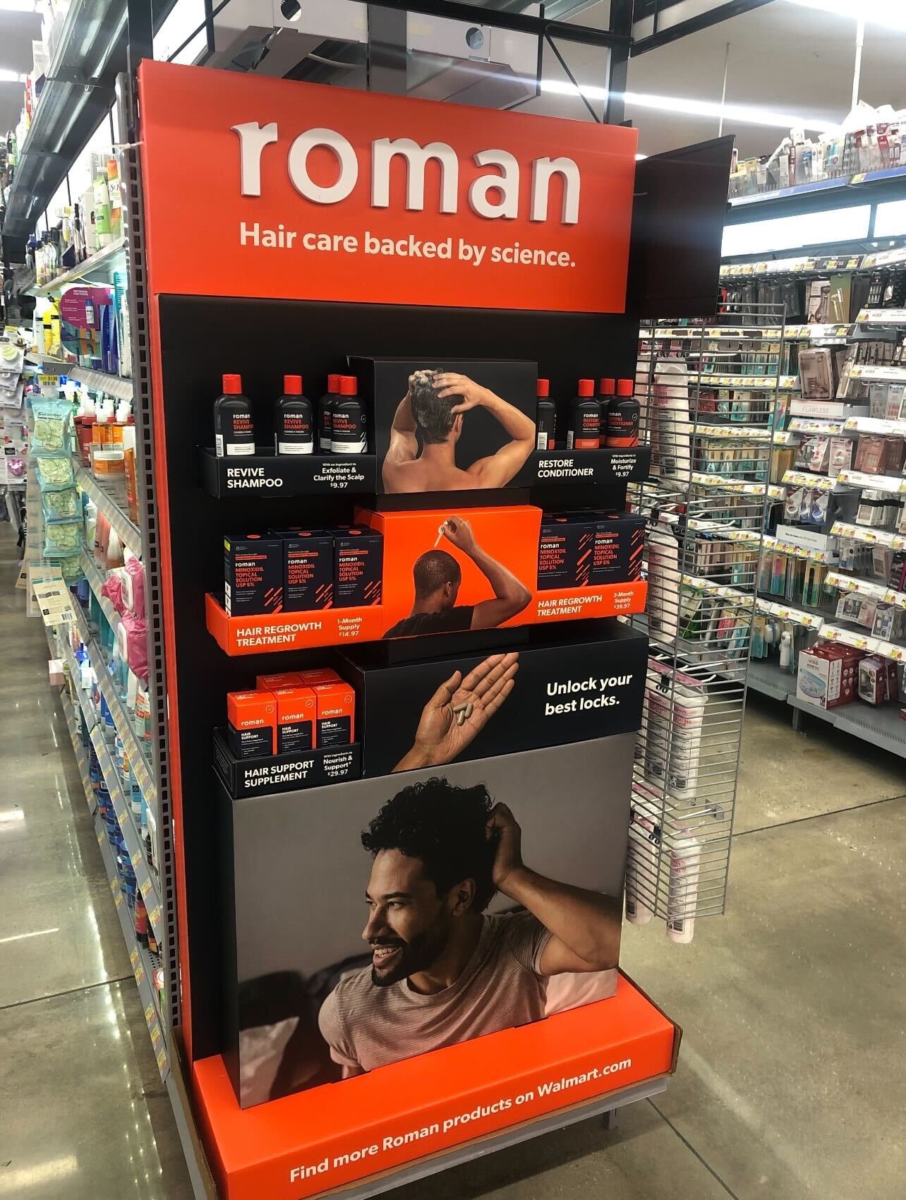
In addition to DTC via their platform, Roman has their line of supplements available at brick and mortar retailers (Walmart, Walgreens, Vitamin Shoppe, etc) and online retailers like Amazon. The look and feel is a bit different for a couple reasons. We needed to standout on shelf. We also had to conform with retailers expectations. I had a hand in steering the new on-shelf product box design, directing product photography, directing the fun animated TV spot above, and designing various in-store activations.

